Product Overview
The Product:
Healthy Paws is an organic pet food app that helps users select products based on their pet’s food preferences. It is targeted at users who want convenience as well as the ability to choose what ingredients their pet/s are eating.
Project duration / Role / Responsibilities:
December 2021 - March 2022 / UX Designer
Conducting interviews, paper and digital wire-framing, low and high-fidelity prototyping, conducting usability studies, accounting for accessibility, and iterating on designs.
The problem:
There are no customizable pet food options for animals who require a certain diet.
The goal:
Our goal is to give the user full control of what their pet eats all while being on your mobile phone.
Understanding the user
User Research:
Interviews were conducted as well as creating empathy maps to better understand the users and their needs. A primary user group identified through research were were pet owners who have pets that have specific dietary needs.
The user group confirmed initial assumptions about potential users of a customizable pet food app, but research also revealed that specific dietary needs were not the only factor behind this idea. Other user problems included busy schedules, convenience, lack of transparency with ingredients, difficulty of online ordering and product uncertainty.
Pain Points:
1. Dietary Restrictions
2. Ordering Incorrectly
3. Ingredient Uncertainty
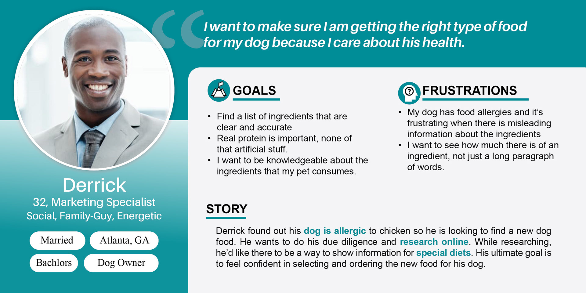
User Personas:
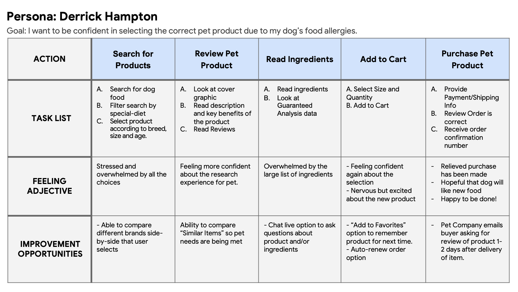
Mapping a user journey revealed how helpful it would be for users to have access to a customizable pet food app according to the specific needs of their pet.
Starting the Design
Paper Wireframes:
Taking the time to draft iterations of each screen of the app on paper ensured that the elements that made it to digital wireframes would be well-suited to address user pain points. For the home screen, I prioritized a quick and easy ordering process to help users save time.
Pink stars were used to mark elements of each sketch that would be used in the initial digital wireframe.
Digital Wireframes:
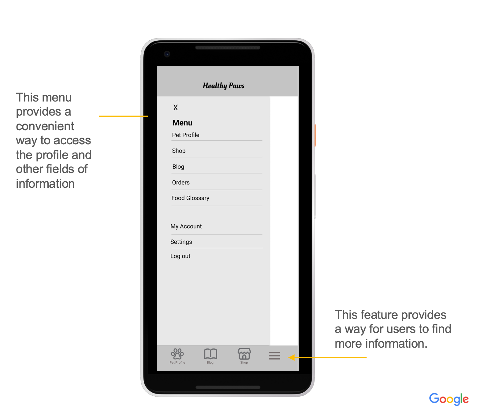
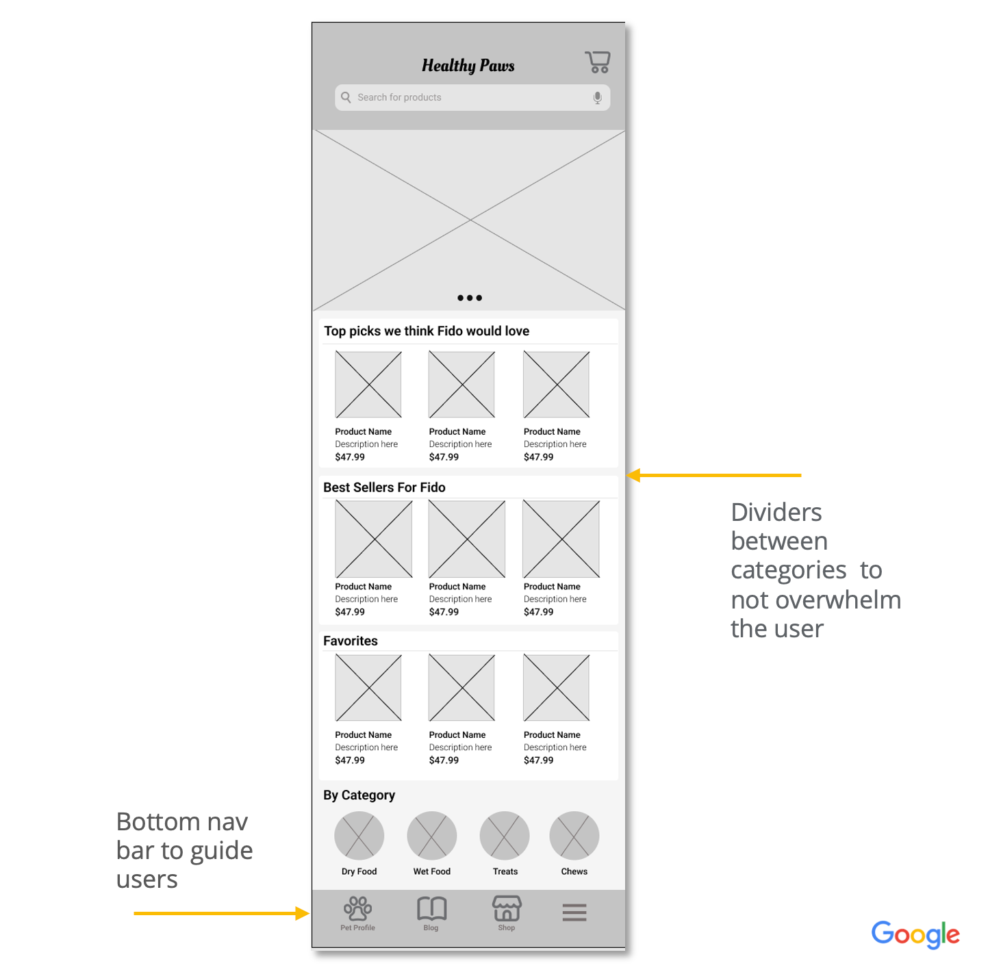
As the initial design phase continued, I made sure to base screen designs on feedback and findings from the user research.
Low-fidelity prototype
The low fidelity prototype connected the primary user flow of customizing and ordering pet food, so the prototype could be used in a usability study with users.
Usability study: Findings
Two rounds of usability studies were conducted. Findings from the first study helped guide the designs from wireframes to mockups. The second study used a high-fidelity prototype and revealed what aspects of the mockups needed refining.
Round 1 findings
1. Users want more customization options when creating their pet profile
2. Users want an auto-renewal option when purchasing
3. Users want a more intuitive way to read the ingredients section of the product
Round 2 findings
1. Users want a better developed transaction process so they can confidently complete an order.
2. Users want a clear way to know which Pet Profile they are on
3. Users want a more intuitive way to read the ingredients section of the product with minimal clicks
Refining the Design
#1
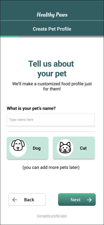
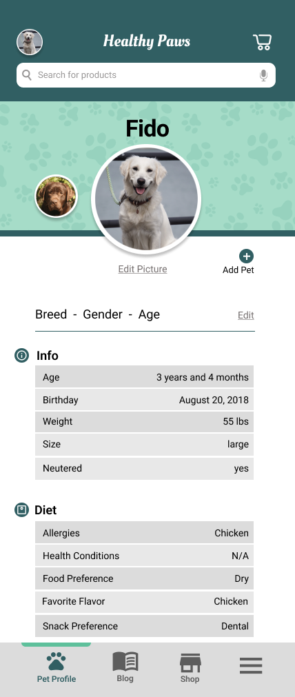
Early designs allowed for no customization for the pet profile icon or a way to switch between other pet profiles. After the usability studies, I added the option to edit the photo so the user could upload an image of choice.
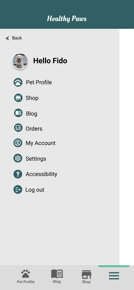
I also revised the design so users can see all pet profiles when they land on the Pet Profile screen. A profile icon was also placed at the top left so users know which pet profile they are on.
#2
The second usability study revealed frustration with the number of clicks involved to read the ingredients. To streamline this flow, the ”Ingredients” now became an accordion that would expand once clicked instead of going to a new page and having to click back to the product page.
#3
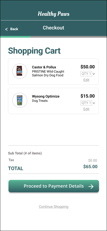
The second usability study also revealed questions about missing fields in the payment flow. To address these uncertainties, I revamped the design to include more informative shipping fields to fill in, a billing address, shipping method options, and option to save a credit card on file.
High-fidelity Prototype
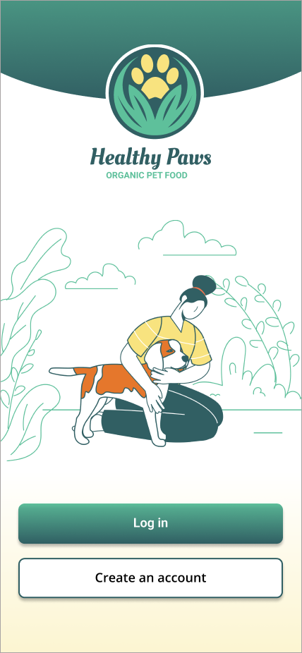
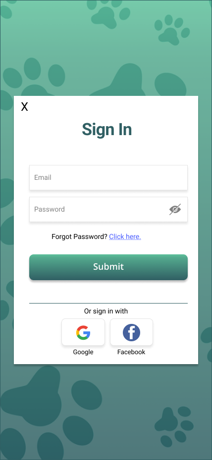
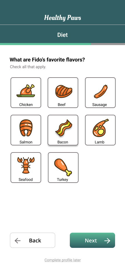
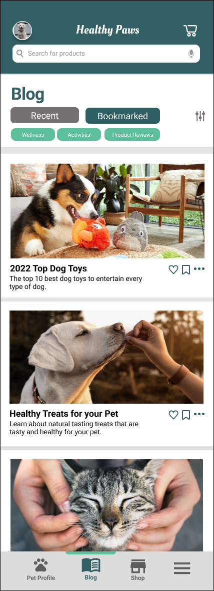
The final high-fidelity prototype presented cleaner user flows for customizing a pet profile, reading the ingredients sections of a product and the checkout process. It also met user needs for finding a product for their pet that they can confidently trust.


Design System
A design system, which consists of visual components and styles was created. The goal of the design system was to create a cohesive experience for everybody, but especially for the user.
Going Forward
Impact:
The app makes pet owners feel that Healthy Paws cares about the dietary needs of their pets.
“The pet profile was easy to complete and I had fun doing it. I feel like this saved me time and I made a good choice for my dog.”
What I learned:
Designing the app has been a challenging and rewarding journey. It was clear from the onset that the major challenge will be to make pet owners trust the customized food options. I researched dietary needs and did a competitive audit of several pet businesses. I understood the needs of the users through the survey and conversations. Usability studies and peer feedback influenced each iteration of the app’s designs.
Thank you!
Thank you for your time reviewing my work on the Healthy Paws app.
The full deck PDF can be viewed here: